Turnstyle
A downloadable game for Windows
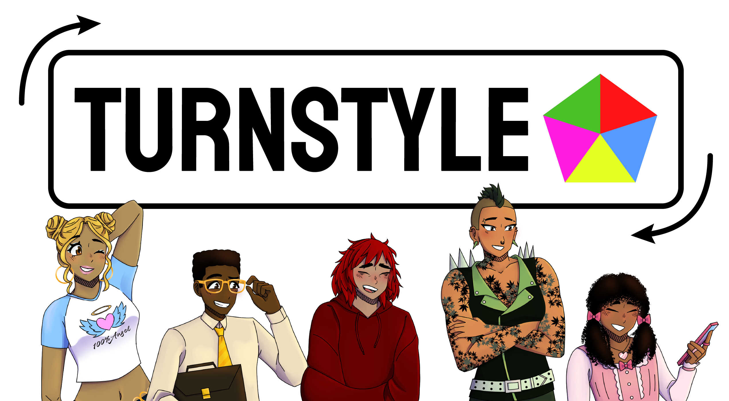
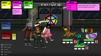
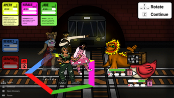
Turnstyle is a turn-based RPG where you balance five party members on a rotating pentagon. Each turn, you can rotate it, so three of them are in and two of them are out of battle. The longer anyone is fighting, the more fatigue they get, so be sure to give everyone plenty of breaks!
Navigate a public transit system infested with monsters, budgeting the party's cash and their patience with each other as you make your way around the city.
Find out what's going on between the strong personalities in this diverse cast and see what's making them fight (or maybe kiss kiss fall in love?)!
Ten different monsters to encounter!
A story of fierce friendships and fiercer fights!
Beta Team:
Art
Emil Saechao
[itch | portfolio]
Mathew Aceves
Mikayla Roberts
[itch | portfolio]
Stevie Rodriguez
[itch | portfolio]
Music
Autumn Moulios
[itch | SoundCloud]
Narrative
Stevie Rodriguez
[itch | portfolio]
Production
Ardent Eliot :-) Reinhard
[itch | Twitter]
Emil Saechao
[itch | portfolio |
Twitter]
Programming
Ardent Eliot :-) Reinhard
[itch | Twitter]
Darcy Phipps
Josh Temple
Kate Noelle
[itch]
Sky Peterson
[itch]
Sound Design
Joey Balaoing
Systems Design
Kate Noelle
[itch]
| Status | Released |
| Platforms | Windows |
| Rating | Rated 1.0 out of 5 stars (1 total ratings) |
| Authors | Lion Slime, trophyhusban, Kate Noelle, alienhime, star☆sapphire, sky, Autumn M, mirsartandstuff |
| Made with | Unity |
| Average session | About a half-hour |
| Languages | English |
| Inputs | Keyboard |
| Links | Homepage |

Comments
Log in with itch.io to leave a comment.
This is a really cool game! Great work on creating such a full experience. I played 3 levels and feel I got a chance to engage with the systems and how the team chose to build the experience.
I'd say my favorite parts are the music and potential. The project has some exciting ideas and overall it feels like an entire great experience that is in need of some critical (but loving) amendments.
The concept is exciting, but I want to focus on what my experience was (because I heard you'll all be continuing to make this game even greater)
Writing/Narrative
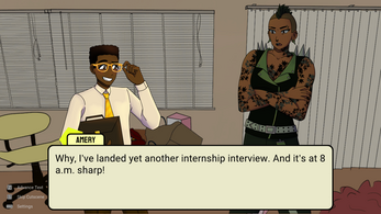
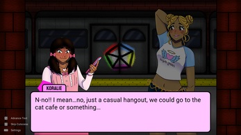
The introduction had some fun writing that set a clear expectation for what our story-dilemma was. Amery needs to get to his interview, and he knows he's not strong enough to do it alone, so he asks his "friends" / roommates to help him. I think small tweaks can be made here, but my only real discomfort was with how long the narrative was. It felt like there was a little too much dialogue that didn't introduce any new ideas. One tip I use is going line by line and asking "what does this dialogue tell the player & did they already know that?" ... You may still choose to keep duplicate information for mood-setting, but I think it will help avoid too much overkill (for example when Seraphim regularly lets us know she doesn't like anyone's morning-bird attitude)
I also feel the enemies in the game don't reflect any part of the environment or world as I know it. My understanding is these are college kids, so I would be curious what enemies could look like if they were representations of real issues college kids have. I know it sounds rough, but this could be a good spot to make enemies like muggers, homeless people, sales-people, protestors, and many more that relate to the issues of traveling through the city. The game narrative could also lean into this where some characters could say things like "did we really need to be so rough to that homeless person... " and another character could justify it by saying "we don't have time!" or even more impactful "these people are just lazy and they should get a job." (i hope you'd put more time into it, but this is the idea I want to get across). The seal and snail-banana are really cool looking, but they make me feel confused as far as world conditions and context.
Programming & Gameplay
I don't think I ran into any bugs, which is awesome, and I know building these kinds of systems is a challenge with all the elements, exceptions, and conditions you need to write. But I think the project would benefit from a reconsideration of what the loop and most important information are. While the game is easy to understand, it often feels overly complex and a lot of information is thrown at me that I don't necessarily feel is important.
To give an example of how over-complicated it "feels" is after killing an enemy I had to wait around 30 seconds while bonuses and buffs applied to my characters where they gained health, lost health, and then gained health again. It felt a little too much to sit through when I'm so early in the game. I somewhat expect these first battles to be obviously easy since the game is following traditional Turn-Based RPGs. Everything (in my opinion) should be way faster unless you already have beautiful animations. This will help with the flow as currently, I'm waiting around quite a bit before making the next move even if I'm doing the same basic attacks.
I think the last big consideration is the turn-style core mechanic. It's a really cool idea to have to consider switching which characters you're using during a fight, and it's not something I've seen in this style of representation. I think it hasn't quite peaked at its full potential. I was expecting there to be a significant reason why I should have one character over another, but its more like some characters are very weak and can only buff, and others are strong but can only fight. So I will usually just use the strong characters and I'm expecting a few matches later I will pay the consequences (which isn't a good feedback time). More likely each character should have 1 core thing they can do, and you should essentially HAVE TO switch characters to win, but as far as which characters should be up to the player. This isn't easy to do, but it is important if you want to really sell this as a unique experience.
Art/UI & Music
As I mentioned, I'm a big fan of art and music. I think the colors and design is really readable, and the music is well crafted. If I were to give feedback on these, I think the music could stand to be more balanced on a long timeline. I enjoy the music, but as I'm learning the game I can already hear everything looping quickly within the first matches. This makes me feel I will become tired of the music quickly and end up playing with the sound off, which is a shame because the jams are done really well!
The art and design is well crafted and considered. I think my biggest suggestion is to spend more time giving the characters some more realistic depth. Especially if they won't move, I think the depth will help a lot to ground the characters. Along with things like ground shadows and environmental lighting. You may choose to make 2D normal maps and take advantage of Unity's 2D lighting solutions. This can be a great time saver. If the current flat look is preferred then I'd strongly suggest getting more animations in as soon as possible. Otherwise, for stills, you can get away with simple-slide animations and VFXs for attacks and spells.
The UI is very colorful and I had no problem telling which character belonged to which UI which is great! I'm worried that you need to display the controls constantly. I think without it the game would be unplayable because many of the buttons and options are not very intuitive. Traditionally, I would be able to click what I wanted to do or use the enter and backspace key to select / go-back. Unless the team has a really meaningful and passionate reason for choosing Z and X... I'd heavily consider changing these to be more traditional buttons and keys. And then you can still choose to display it, but most likely most people will not need to search the screen for all their control options.
And currently, the screen is very busy. It almost feels too noisy to read, but the great color mapping saves this from happening.
Overall
Great stuff! and I think with some strong intentions and critical design eyes, this game will be a serious hit. Currently, when I saw how many battles I'd have to go through to complete the first quest/mission I was not excited, but with these changes, I would be really excited to come back and test myself. Generally, as long as you guys are open to feedback, I think you have something special here! Great work and I am so excited to see future releases!